


UPDATED 2023-06-27: New details and solutions.
IMPORTANT: When uploading photos to Webflow's assets, it's best to make certain that they are correctly oriented ( rotated ) before upload.
Camera phones are used increasingly by clients to capture photos of their business, however today's phones store those photos with an EXIF Orientation tag.
This tag is then used by software that displays that image - including web browsers - to orient the image properly for display.
Without that information, the image is displayed sideways or upside down.
The Bug
Webflow unfortunately strips that EXIF data on upload to assets, including the image orientation. This means that when that image is served to modern browsers, those browser must assume that the photo was taken landscape, unflipped, and that no adjustment is required.
To further confuse things, the designer shows the image in its correct orientation, with the orientation flag is proper use.
This confuses the heck out of designers, who designed the site one way, and then all of the images are broken in the published site.
A Demonstration
Take a portrait selfie, upload it to assets, publish it, download the published image, and view the images in Google Chrome. You will see the problem immediately.
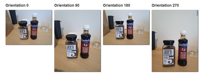
Here I've taken 4 images on my Samsung Galaxy Note 10x, rotating the camera 90 degrees with each shot. Here’s how Chrome displays those 4 images, unedited, from the camera;
If I then upload those 4 images into Webflow assets and display them, the orientation is stripped, and the browser loses the ability to display them properly.
Here are how those same 4 images appear on my published Webflow site;
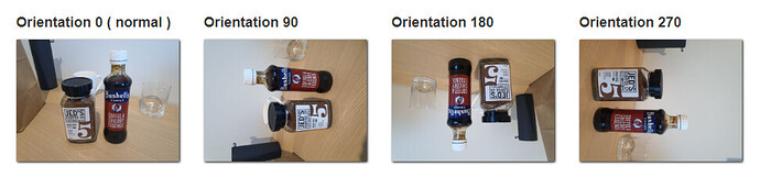
These are the exact same 4 images, unedited, but "broken" by the EXIF-stripping behavior of Webflow’s assets upload.
FULL DEMO - Have a look for yourself.
What Causes This
It turns out that the main problem here is Webflow's Responsive Images feature. By default, every image element you place on your site is configured to generate responsive images.
This means that it will take your photo, and create smaller versions of it that can be used by a mobile phone browser for faster download.
It's a great technology, and makes the web lighter and faster.
However there a bug in Webflow's implementation of this feature. When responsive images are generated, Webflow strips the EXIF data from all of the generated images including the full-size version of the image intended for desktop view. ( retested 2023-06-27 ).
However, the image content itself is not reoriented, so browsers display the image data as if it were correctly oriented, and it's not. You get images that fall on their side, or are upside down, depending on the orientation of the camera when it was captured.
To further complicate things, the Responsive Image feature is automatically turned on, and the setting is hidden.
How to Prevent This
There are two ways to prevent this;
Disable responsive images
In places where you are displaying images that have been captured by a mobile phone, you can selectively disable responsive images on those individual elements.
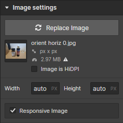
You do this by selecting the image element in the designer, and pressing CTRL+SHIFT+O ( Win ) or CMD+SHIFT+O ( Mac ) to display the Responsive Image checkbox.
When it's visible, you'll find Responsive Image under the Image settings for that element.
This is also possible in images that you embed in a Rich Text element, however you need to right-click that image and choose Settings from the pop-up menu.
Edit your mobile phone photos before upload
For images captured by a mobile phone, edit your photos before upload, and re-orient the image.
Most photo editors will correctly display the image based on the image-orientation EXIF data - but when you save the image, they will re-orient the data so that it displays correctly at orientation 0. Simply opening and saving the image may do the job, or open and the export it as a new file.
You'll need to find a program that does this correctly- Photoshop is good if you have it.
Scenarios that Need Testing
There are two scenarios where disabling responsive images may not work, but I've not tested these yet;
- When a Rich Text element is CMS-bound, it may not be possible to configure the Responsive Image setting for those images. This needs to be tested in the designer.
- When a customer embeds an image into a Rich Text element using the Editor, I'm not certain that the Editor offers a means to disable responsive images there.
Let me know if you test these, and what you find.
Technical Notes
If you want to understand why stripping EXIF data breaks the display, here are the technical details.
How EXIF orientation works;
When a photo is taken by a cameraphone, the software captures not only the image, but the details of how the phone was oriented, and what mirroring settings you used ( selfies are often flipped).
EXIF encodes this orientation as a number from 1 to 8- which is then used by the photo-viewing software to orient the photo correctly for display.
- 1 = 0 degrees: the correct orientation, no adjustment is required.
- 2 = 0 degrees, mirrored: image has been flipped back-to-front.
- 3 = 180 degrees: image is upside down.
- 4 = 180 degrees, mirrored: image has been flipped back-to-front and is upside down.
- 5 = 90 degrees: image has been flipped back-to-front and is on its side.
- 6 = 90 degrees, mirrored: image is on its side.
- 7 = 270 degrees: image has been flipped back-to-front and is on its far side.
- 8 = 270 degrees, mirrored: image is on its far side.
Here's what that looks like;

Resources
- EXIF orientation handling is a ghetto
Notice, this article is from 10 years ago.