


CSS grids are a staple in modern web design, but once in awhile you'll see strange inconsistencies like this...

Even though the columns are clearly evenly-sized.

Why this happens
CSS Grid's 1fr is not the same as minmax(0, 1fr)
In our example above, the CSS rule for the grid is:
css
.grid-4-col {
  grid-template-columns: 1fr 1fr 1fr 1fr;
}
This looks like it should produce 4 equal columns, but there's a subtle and very common CSS Grid gotcha here: 1fr is actually shorthand for minmax(auto, 1fr), not minmax(0, 1fr).
The auto minimum means a column will never shrink below its min-content size -- i.e., the smallest it can be before content would overflow or get cut off.
What's driving the min-content size?
In this example, the card headings use letter-spacing: 7px and text-transform: uppercase, which gives each word a relatively wide intrinsic size. Since word-break: normal is in effect, the browser will never break a word mid-character -- so the minimum width of a column is determined by its widest single unbreakable word (plus the card's inner padding of 38px on each side = 76px total horizontal padding).
Here's the per-column breakdown:
| Column | Heading (row 2 is the driver) | Widest word | Min-content + padding | Actual width |
|---|---|---|---|---|
| 1 | "Commercial Fleet Cleaning" | COMMERCIAL | ~239 + 76 = 315px | 316px |
| 2 | "Dog Hair Removal" | REMOVAL | ~171 + 76 = 247px | 249px |
| 3 | "Waterless Cleaning" | WATERLESS | ~210 + 76 = 286px | 287px |
| 4 | "Healthcare Vehicle Cleaning" | HEALTHCARE | ~233 + 76 = 309px | 310px |
The expected equal width would be (1200px total − 48px gaps) ÷ 4 = 288px. Columns 1 and 4 are forced wider than 288px by their content's minimum size, and column 2 (with shorter words) ends up narrower to compensate, since the total must still sum to 1200px.
The Fix
Change the grid template columns from 1fr 1fr 1fr 1fr to use explicit minmax(0, 1fr) for each column, which overrides the auto minimum with 0, allowing content to wrap freely at any width:
css
.grid-4-col {
grid-template-columns: repeat(4, minmax(0, 1fr));
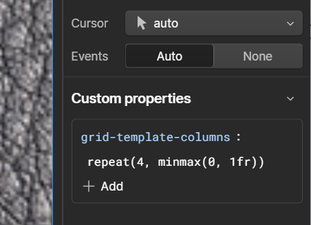
}This can be applied in Webflow using the Custom properties feature on the style panel;
Note that these settings appear to only apply to the current breakpoint, but in most cases this is exactly what you want.
Here's our end result, with the fix applied;

Notes
If you see overflow problems inside any of your grid cells, you might be facing a circular calculation. You can override that with grid-template-columns .
.valet-link {
  grid-template-columns: 100%;
}