

UPDATED: 2023-06-27 to add some new findings and solutions.
Perhaps you've encountered it on your own sites...
An image on your layout looks perfectly fine in Webflow's designer, but when you publish the site, it suddenly rotates on its side, or flips upside down. Sometimes it mirrors itself.
If you're like me, you've muttered... "whoa." And rubbed your eyes disbelievingly.
What's happening? And then you frantically try to fix it...
- You re-publish your site.
- You re-open the image to make sure it looks ok, and it looks fine.
- You shake your cameraphone gently and listen for any loose parts rattling around...
... because, WTF, right?
And none of it helps.
Why this Happens
This is a story of technology progression, and how gaps that once weren't so wide can become a chasm that's all too easy to fall into.
To understand this, we need to understand how cameraphones work, and how the Internet works and how Webflow breaks those rules. Because... they don't quite line up.
LET'S START WITH... camera phones
Camera phones are used increasingly by clients to capture photos of their business. They photo their staff, their clients, their projects.... the awesome restaurant dishes they've prepared... the bedroom they interior-decorated... and the parties they DJ'd.
Photos tell the story, and when there is story to be told, often your camera phone is the closest thing handy to capture that moment.
It's an Instagram world.
But, unlike most cameras, camera phones can be held in variety of different ways, which affect how the photo is captured.
In fact, there are 8 different ways a camera phone can take a photo.
4 different ways that the camera can be rotated;
- Normal landscape
- Camera rotated left 90
- Camera rotated right 90
- Camera upside-down
Times 2 different ways the image can be mirrored.
- Regular "un-mirrored" mode, which is usually the mode for the away-facing camera
- Horizontally-mirrored "selfie" mode, which is usually the default for the self-facing camera
Here's the thing;
Behind the scenes, in the photo's file structure, the camera always captures and stores the photos exactly the same way. But it also captures the orientation and mirroring settings, and stores them with the photo- so that it can be displayed in the same way it was taken.
This information about how the photo was taken is encoded in EXIF data.
EXIF encodes this orientation as a number from 1 to 8.
- 1 = 0 degrees: the correct orientation, no adjustment is required.
- 2 = 0 degrees, mirrored: image has been flipped back-to-front.
- 3 = 180 degrees: image is upside down.
- 4 = 180 degrees, mirrored: image has been flipped back-to-front and is upside down.
- 5 = 90 degrees: image has been flipped back-to-front and is on its side.
- 6 = 90 degrees, mirrored: image is on its side.
- 7 = 270 degrees: image has been flipped back-to-front and is on its far side.
- 8 = 270 degrees, mirrored: image is on its far side.
Here's what that looks like;

MEET... the Internet
Modern image viewers and web browsers know this EXIF data is essential to displaying the photo correctly, so when you view the photo, your browser uses that EXIF data to orient and flip the photo properly.
Just like magic.
Take your photo however you want, and it will display exactly the way you intended to capture it- as long as the photo contains that EXIF data.
ENTER... Webflow
Unfortunately, here's where things go sideways.
Any time you upload an image to Webflow, Webflow stores that image in assets, and it appears to maintain all of the necessary EXIF data. Because of this, camera phone photo that are placed in the designer look right.
Until you publish them.
On the published site, they'll suddenly be rotate, flipped, or upside-down.
This happens because the EXIF data is getting stripped from the images that appear in the published site.
Why are these different, you ask?
The answer is a very useful feature Webflow has added known as Responsive Images.
The responsive images feature takes your original image and generates a range of different sizes of that image, so that mobile phone browsers can use smaller images
It's a phenomenal idea.
But, for whatever reason, Webflow unfortunately strips that EXIF data when creating those responsive images, including the image orientation. It even strips them from the full-size version of the image, which is also re-generated when responsive images is enabled.
This means that when that image is served to modern browsers, the browser must assume that the photo was taken landscape, unflipped, and that no adjustment is required.
If that's not how you took the photo... you're going to get some weird results.
Surprise!
Want to see this in action?
A Demonstration
Take a portrait selfie, upload it to assets and add it to your page. Publish your site, and view the published page. You will see the problem immediately.
Here I've taken 4 images on my Samsung Galaxy Note 10x, rotating the camera 90 degrees with each shot. Here’s how Chrome displays those 4 images, unedited, from the camera;

If I then upload those 4 images into Webflow assets, add them to my site, and publish them, the orientation is stripped and the browser loses the ability to display them properly.
Here are how those same 4 images appear on my published Webflow site;
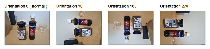
These are the exact same 4 images, unedited, but "broken" by the EXIF-stripping behavior of Webflow’s responsive image generator.
DEMO - Have a look for yourself.
How to Prevent This
There are two ways to prevent this;
Disable responsive images
In places where you are displaying images that have been captured by a mobile phone, you can selectively disable responsive images on those individual elements.
This has nothing to do with the image itself, and everything to do with the Image Element it is being displayed in.
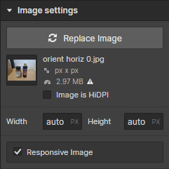
You can disable responsive images by selecting the image element in the designer, and pressing CTRL+SHIFT+O ( Win ) or CMD+SHIFT+O ( Mac ) to display the Responsive Image checkbox.
Once you've made it visible, you'll find a Responsive Image checkbox under the Image settings for that element.
Uncheck this, and republish your site. You'll lose responsive images too, but at least your camera phone images will appear correctly.
This is also possible in images that you embed in a Rich Text element, however you need to right-click that image and choose Settings from the pop-up menu.
Edit your mobile phone photos before upload
For images captured by a mobile phone, you can edit your photos before upload, and re-orient the image and then save it in its corrected form.
When you open a camera phone image, most photo editors will correctly display the image based on the image-orientation EXIF data - but when you Save the image, they will re-orient the data so that it displays correctly at orientation 0.
Simply opening and saving the image may do the job, or open and the export it as a new file. You'll need to find a program that does this correctly- Photoshop is good if you have it.
Scenarios that Need Testing
There are two scenarios where disabling responsive images may not work, but I've not tested these yet;
- When a Rich Text element is CMS-bound, it may not be possible to configure the Responsive Image setting for those images. This needs to be tested in the designer.
- When a customer embeds an image into a Rich Text element using the Editor, I'm not certain that the Editor offers a means to disable responsive images there.
Let me know if you test these, and what you find.
Resources
- EXIF orientation handling is a ghetto
Notice, this article is from 10 years ago.