

Webflow does a lot to optimize your images for mobile devices, but it can't do everything.
Here are some key things to understand, and best practices to follow when uploading images to your website.
How Webflow handles Images
If you're familiar with HTML, you may find this interesting and informative. If you're not, you can scroll down to the best practices.
- Webflow provides a 4MB limit on image size uploads. Sometimes that feels like a pain ( why not offer a resize option? ). However it's there to protect you.
- The uploaded image is left unchanged as the original artwork. This is good, if you've prepared it - but often not so good for clients are uploading their own artwork, and don't understand image optimizaton.
- Image elements use the HTML srcset attribute to provide a range of resized image variations for the browser to choose from. This makes the mobile experience faster, because browsers on smaller displays can choose to download smaller image sizes.
- However, images applied as background artwork do not have srcset support, you only get the original image size, even on mobile devices. This can crush data plans and website performance on phones if you're not careful.
- The image format ( JPEG v PNG ) is preserved, even in the resized variants. So if you upload a PNG that's used in an Image, Webflow creates resized variations - but maintains PNG format. If you're uploading photos as PNGs, then all versions of that image will be about 2x to 3x larger file size than needed.
You need to prepare the original uploaded image carefully. If you don't, your website will look slow, possibly affect your SEO ( as a slow-loading website ), and you'll chew through a lot of mobile data unnecesarily.
Best Practices
My current best-practices are -
- As a rule, always use JPEGS for photos and PNGs or SVGs for logos.
- Keep the original image dimensions to a minimum, for the largest expected desktop view. Even for the large top-of-page "hero" area photos, I aim for about 1400 px wide maximum, for landscape-oriented photos.
- Optimize the file size for the image content. Photoshop's export-to-web tool does this well, where you can visually see the effect of different JPEG compression levels, and choose the best. There are other tools now which take this even further using artificial intelligence.
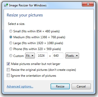
- If you are not a photoshop user, use Image Resizer for Windows, set to "Medium" size. It's free and very easy to use, and integrates directly with the Windows Explorer.